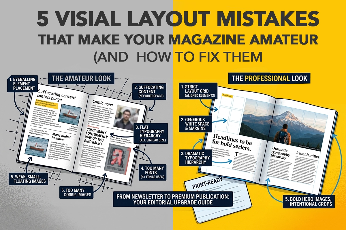
5 Visual Layout Mistakes That Make Your Magazine Look Amateur (And How to Fix Them)
By by iBoo Team
Discover how iBoo makes it simple to create, flip, print, and distribute your magazine worldwide.
You’ve curated incredible articles, conducted fascinating interviews, and finalized your content. But when you look at the initial layout, something feels off. It doesn't look like the premium titles you see on boutique newsstands; it looks a bit like a school newsletter or a corporate brochure.
What separates amateur self-published magazines from high-end, professional flagships isn’t the quality of the paper or the budget of the team. It almost always comes down to micro-decisions in layout design.
When creating a magazine—whether digitally or for print-on-demand—avoiding these five common visual pitfalls will instantly elevate your publication.
1. Ignoring the Invisible Grid
The absolute quickest way to make a layout feel messy is to eyeball your element placement. Amateur designs often feature text boxes, images, and pull-quotes that are just slightly misaligned from page to page. The human eye detects these inconsistencies immediately, registering them as chaotic.
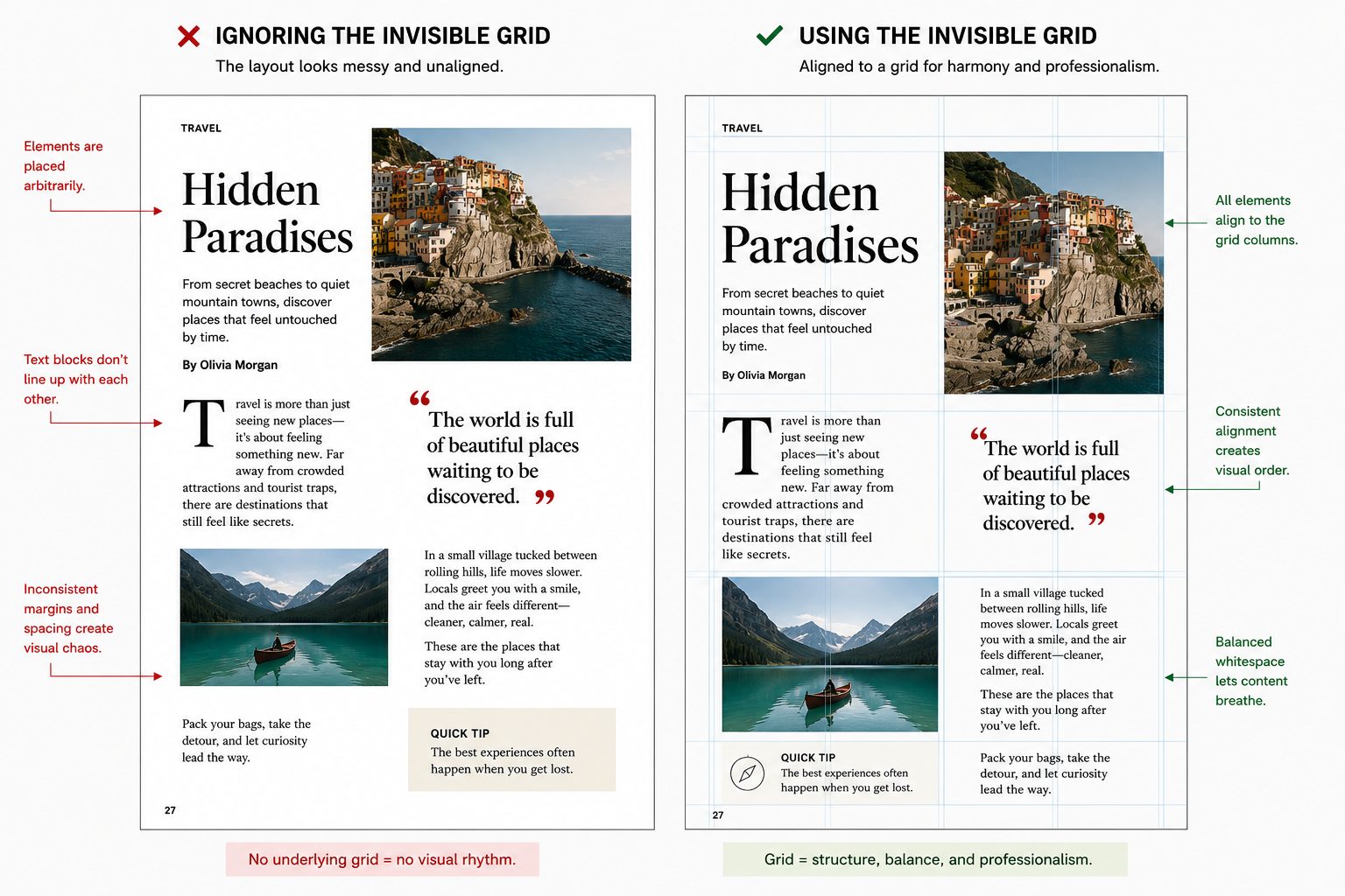
Standard modular magazine grid layouts. Source: patricia gomez - WordPress.com
The Mistake: Placing text columns and images arbitrarily on the canvas without an underlying mathematical structure.
The Fix: Establish a strict layout grid (like a standard 3-column or 12-column grid) before placing a single asset. Every text block, image edge, and header should snap perfectly to these grid lines. Consistency across pages creates a visual rhythm that anchors your entire issue.
2. Suffocating Your Content (Fear of Whitespace)
When you are paying for printing or trying to pack as much information as possible into an issue, it’s tempting to fill every square inch of the page. This is a classic trap. Empty space is not wasted space; it is a premium design tool.
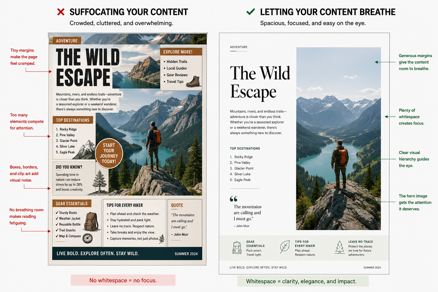
The Mistake: Crowding text blocks right up against images, using tiny margins, or filling empty corners with unnecessary clip art or decorative shapes.
The Fix: Let your pages breathe. Leave generous margins around the edges of your pages (at least 0.75 inches or 20mm for print). Use whitespace intentionally to direct the reader’s eye toward the most important element on the page, like a striking image or a powerful headline.
3. Flat Typography Hierarchy
If your headlines, subheadings, and body text all look relatively similar in size or weight, your pages will look incredibly flat. A professional magazine layout tells the reader exactly what to look at first, second, and third.
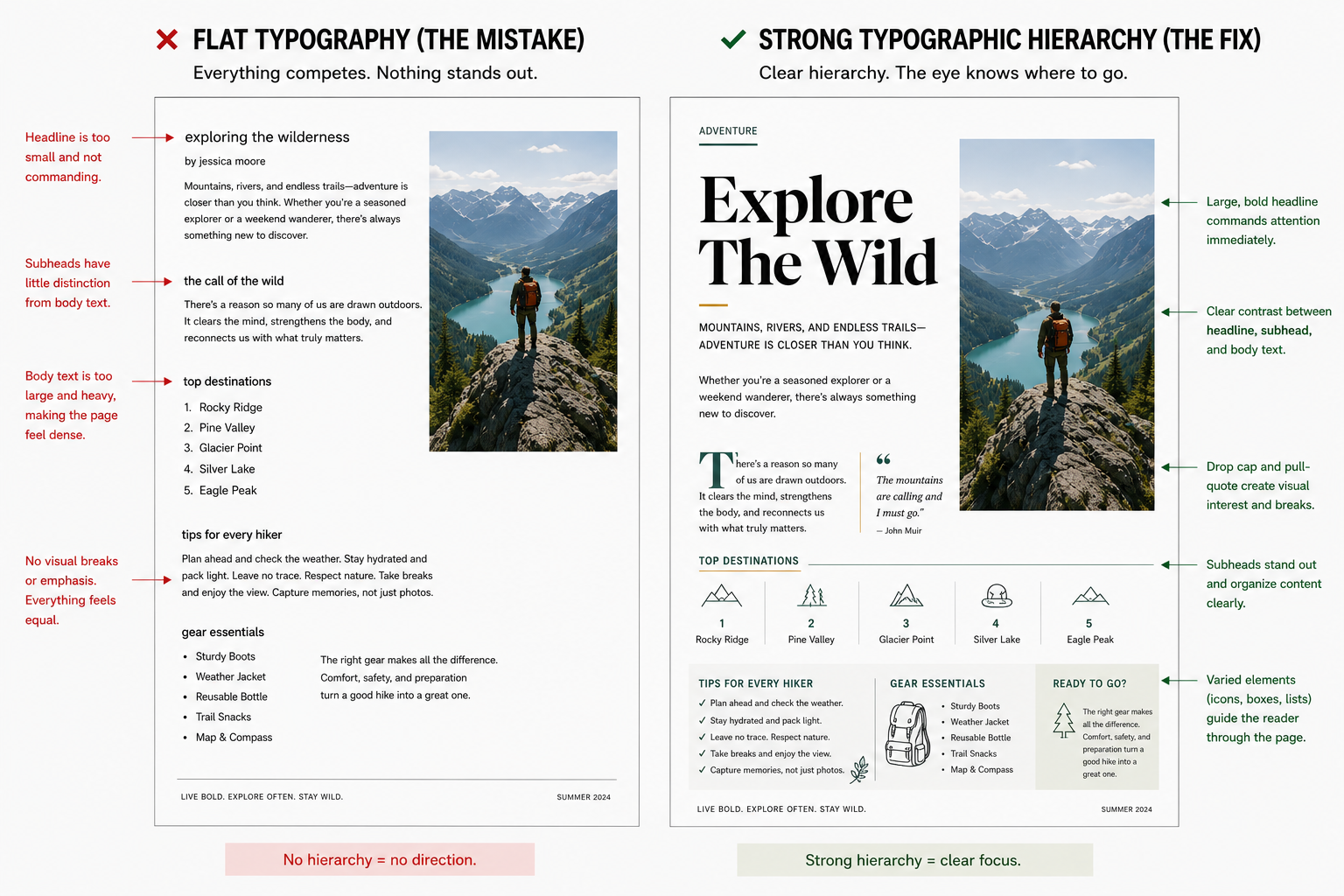
The Mistake: Making headlines too small, body copy too large (a common amateur mistake is using 12pt font for magazine body copy—professional magazines usually use 9pt to 10.5pt), or failing to contrast font weights.
The Fix: Create dramatic contrast. If your body text is a clean, light sans-serif, make your article titles bold, large, and expressive. Use distinct styling for your drop caps and pull-quotes to break up long blocks of text and guide the reader's journey through the page.
4. Overcomplicating Your Font Choices
When designing a magazine, it’s incredibly fun to browse font libraries. But bringing too many of those options into a single issue is design suicide. A chaotic mix of fonts screams "amateur hour."
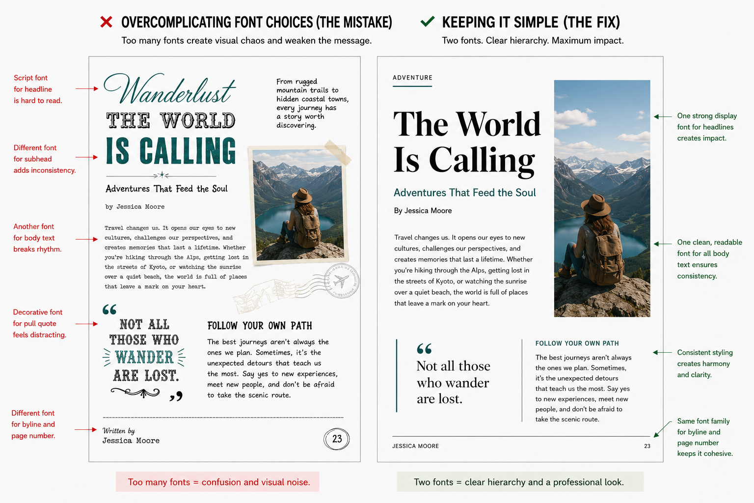
The Mistake: Using four or five different font families across a single feature article (e.g., one for the header, one for the subhead, one for body copy, one for pull-quotes, and another for page numbers).
The Fix: Adopt the "Rule of Two." Choose one distinct, personality-filled display font for your major headlines, and one highly readable serif or sans-serif font for your body copy. You can vary the weights (bold, regular, italic) or sizes within those two families to create all the hierarchy you need.
5. Weak Image Treatment and Crop Choices
A beautiful photo can be completely ruined by poor placement or tentative cropping. Amateur layouts often feature small, floating images surrounded awkwardly by wrapping text, or photos squeezed into rigid shapes that clip the subject unnaturally.
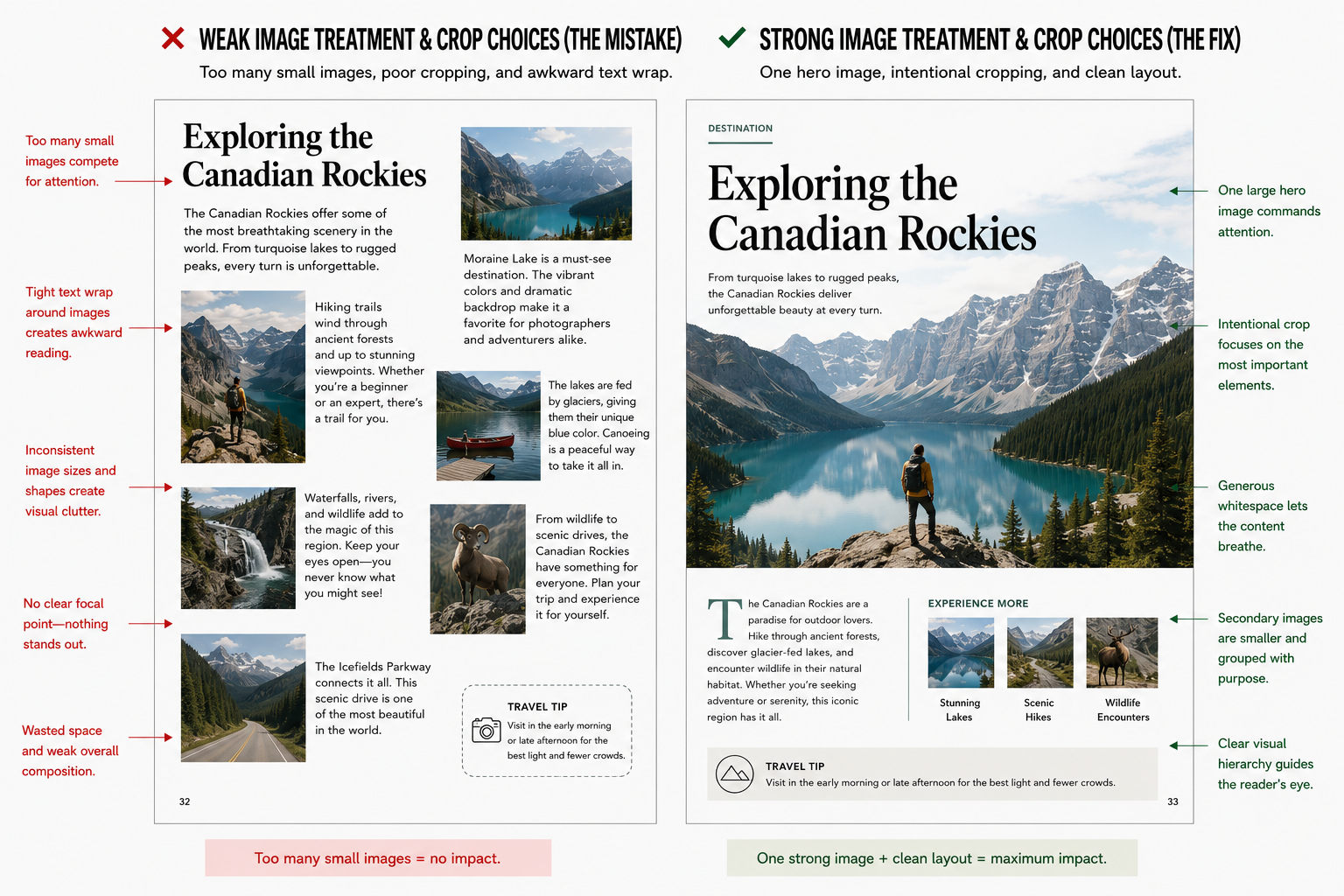
The Mistake: Using too many small, similarly sized photos on a single spread, or letting body text wrap tightly around an irregular image shape, making the text lines hard to read.
The Fix: Go big or go home. Design your spreads around a single "hero" image that commands the page—sometimes even stretching across the entire two-page spread (a full bleed). If you have secondary photos, group them intentionally and ensure they are significantly smaller than the main focal point to maintain balance.
The Professional Checklist
Before you hit "Publish" or send your files to the print-on-demand queue, do a quick visual sweep of your master layout:
ElementWhat to Double-CheckMargins & GuttersEnsure your text is completely clear of the inside binding gutter so it doesn't get swallowed when printed.Body Text SizeKeep body text between 9pt and 10.5pt for a sophisticated, editorial look.AlignmentFlip through the pages quickly; do the headers and page numbers sit in the exact same spot on every leaf?Color ConsistencyStick to a defined palette of 2 to 3 core colors throughout the specific article feature.
By mastering these subtle layout choices, your digital creations will seamlessly transform into beautiful, authoritative print products that look right at home on any coffee table.